plugged magazine
Publication Design | Typographic Layout | Brand Identity | Wordmark
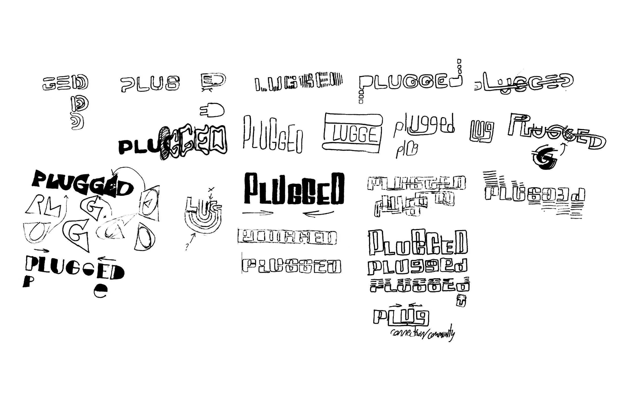
PLUGGED boldly dives into unconventional and experimental sounds of artists in the rising underground music community. The term plugged has two meanings: plugging something in gives it power, and to plug something can be to promote or share it. Both these concepts reflect PLUGGED by “plugging” readers into new music and rising artists.
what??


why??
The intent of this experimental publication is to be exciting, unsettling, and loud. This is achieved through the use of repetition, layering, and texture. The page size is 8x15 to mirror the vertical motion of the wordmark. The glitchy feel of the design visually resembles the technology used and the electronic emphasis.
how did we get here??
PLUGGED’s word mark is bold to reflect the energy of the music and the complexity of the artists’ personalities and lore. The digital feel emphasizes the importance of technology and its role in helping artists grow and connect through streaming services such as Soundcloud.
the process

the products


this is not what plugged is about
But alas, I am a designer and it must be done.


