Honfest
Branding | Environmental Graphic Design
hey, HON!
HONfest is an annual street festival in Baltimore, MD that celebrates working women of the 50s and 60s. It pays homage by playing into the kitsch and campiness of their clothing, dialect, and overall attitude. “Hon,” short for Honey, is a classic Bawlmer term of endearment. For generations, it has expressed warmth and affection bestowed upon neighbors and visitors alike. There is a glamorous energy that comes from the drag community’s part in HONfest.


current logo analysis
No high resolution image of current logo
Typeface and colors are not effectively utilized
Not a strong hierarchy
Brand identity of honfest is unclear

the vision


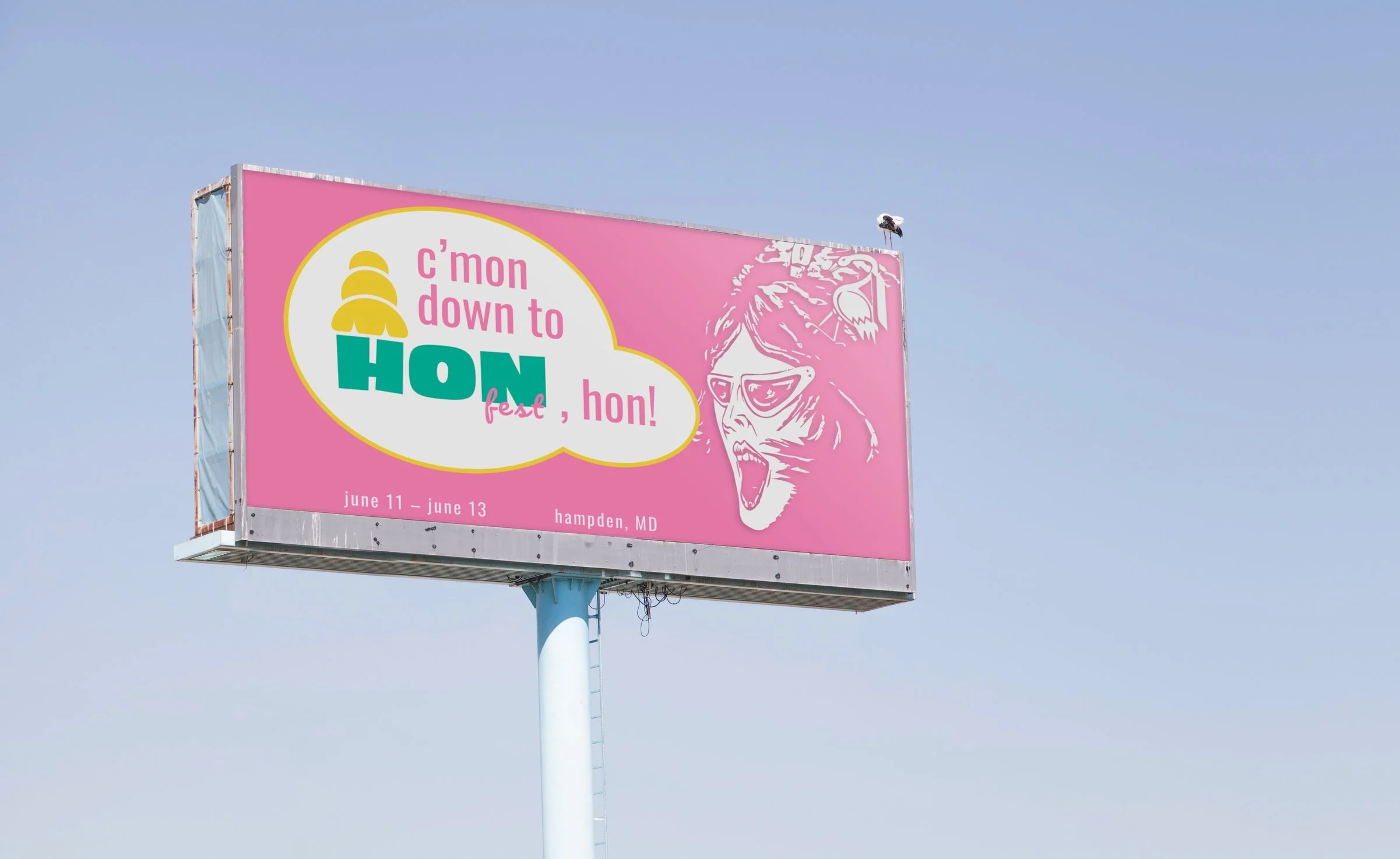
HONfest is an extremely campy event, so the logo had to be over the top, dramatic, and a little tacky. The kitsch of the whole event called for a visually striking and noticeable logo. The branding focuses on Hon’s of qualities, such as their beehive hair and sunglasses. Old motel signs and lawn flamingos also serve as inspiration.


Final Look
The full HONfest rebrand provides opportunities for touchpoints to incorporate the new identity into the experience of this event. You can capture a memory at the photo opportunity at the entrance, or with the VIP experience. Find your way around with the map and informational guidebook and get a drink in a novelty HONfest cup.